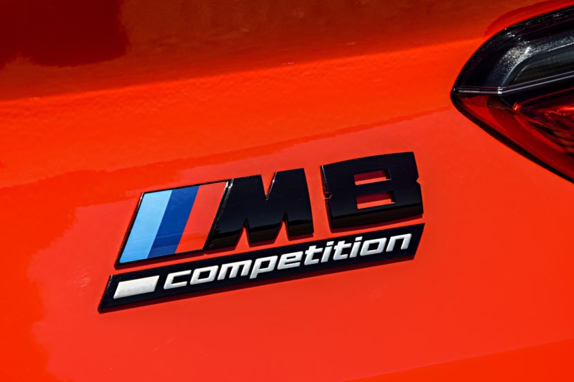
A Deeper Dive into the History of the BMW M Logo Colors


A little while back, we told you the origin story of the M Division’s logo colors. Over the years, there’s been a lot of debate as to how BMW M decided on its colors for the now-iconic three stripes. If you were to ask BMW right now about the meaning behind the M stripe colors, the answer would be that the blue represents BMW, the red represents motorsport and the violet is a mixture of the two, hence why the violet is sandwiched in between the blue and red. However, there’s actually a longer, more interesting story behind how BMW came to use those colors and, while more complex, the aforementioned meaning is still somewhat true.
According to the motorsport historian for BMW Group Classic, Marc Thiesbürger, the origins of the three M stripes actually have to do with a previously potential partnership between BMW M and Texaco, back in the early ’70s. Back then, BMW was attempting to partner with Texaco, as a sponsor for the brand’s motorsport endeavors. During talks with Texaco, but prior to the deal being finalized, BMW M decided to court Texaco by producing a new racing livery with its potential partner in mind.

So the now-legendary three-stripe BMW M livery was born. The blue represented both BMW and the Bavarian flag, while the red represented Texaco, as it was the brand’s primary color. The dark blue was a combination of the two. This was BMW’s attempt at showing solidarity with its hopefully soon-to-be partner at the time. However, the deal with Texaco ended up falling through and the two brands never actually worked together.
Despite that, the livery looked so good and was adored by the BMW M team, so it stuck around and the Bavarians stuck with the aforementioned alternative meaning, with red representing motorsport instead of Texaco.
There’s no official documentation proving the Texaco story. However, Thiesbürger reckons it’s the truth after doing a ton of digging into the BMW M archives. He found that the man who designed the famous livery was Wolfgang Seehaus, whose early iterations of the livery actually featured the Texaco logo on them, which was the only red in the design at the time. However, the red stripes came soon after that. Thiesbürger thought that it was odd to feature both the Texaco logo and the red stripe, the latter of which BMW hadn’t ever used before, prior to actually having finalized. So his only theory is that BMW M was attempting to court Texaco into a partnership.

Here’s where it gets tricky, though. A former colleague of Seehaus, Manfred Rennen, claims that Texaco had nothing to do with the red in the livery. This leads some enthusiasts to dismiss the Texaco theory. However, Thiesbürger found no evidence that Rennen worked on the project at all, so there’s nothing concrete to disprove the theory, either.
While there’s technically no evidence of a potential Texaco deal influencing the M Division’s color choice, there is some testimony from an extremely reliable source. According to Thiesbürger, one man that claims to confirm the Texaco theory is none other that Jochen Neerpasch, the legendary former director of BMW M. Neerpasch is a legend in the world of motorsport and one of the most highly respected members of BMW’s history. Though, Neerpasch does also claim that there were other factors in the Seehaus’ color choice as well, including their differentiation for black and white photos. But both things can be true.

To make the BMW M logo even more interesting is the fact that, while the colors were put together by Seehaus for a racing livery, the actual logo itself was designed by a slightly more famous designer. The world-famous M logo design, with the three colors stripes leaning on the letter “M”, was actually outsourced to a fellow by the name of Giorgetto Giugiaro. In fact, the logo’s nickname is actually the “Giugiaro M”.
Few automotive logos in history have such history and legend. What’s great is that BMW M is so open about the messy and almost uncertain nature of it. That mystery adds to the legend and makes it even more endearing. It also helps to make the brand even more iconic than it already is.
[Source: BMW]
The article A Deeper Dive into the History of the BMW M Logo Colors appeared first on BMW BLOG
