BMW sets record straight on the meaning of its logo


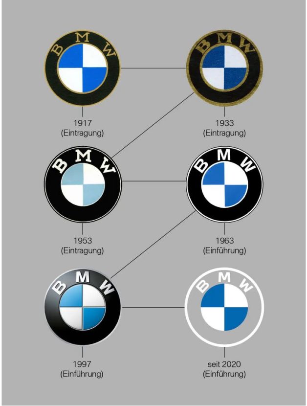
BMW is one of the oldest car makers in the world. The company celebrated its 100th anniversary in 2016 but its origins can be traced even further back. The Rapp Motorenwerke company used to do a lot of work in the aviation sector. Over time, the Bavarians changed its logo a few times, and every time people found it unnecessary, just like today.
BMW just mentioned a couple of changes being done to the legendary roundel and the Internet was in up in the arms. It’s only natural for a company to change its logo and keep up with the times. This sort of change is usually done with a lot of care though as a brand’s identity will depend on the images it has been associated with in most of the times.
In the case of BMW, this happened more than once over the years but with these changes, a lot of myths also popped up. Therefore, now that the online marketing brand’s style has changed, the Germans felt like they need to make some things clear.

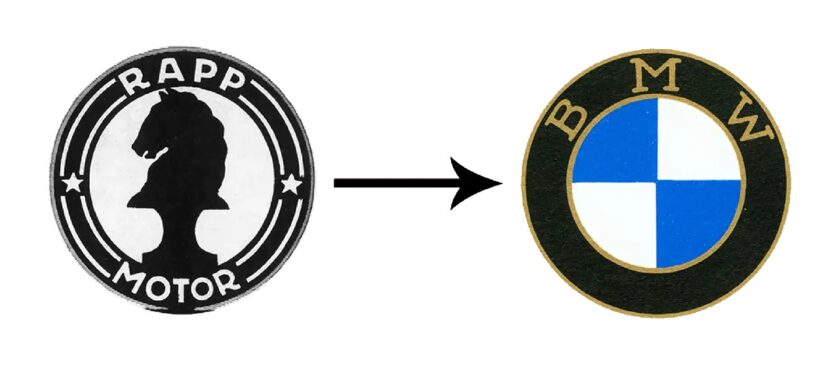
Therefore, BMW published a full guide to what its logo actually means. It all started with the aforementioned Rapp Motorenwerke logo and move on from that.
Initially, the company didn’t really need a logo as people were not making associations between brands and an image like they do today.
However, the first roundel did come about in 1917 and it featured the shape of the old Rapp logo (a roundel) and had the Bavarian flag colors inside in inverse order. That was basically it so no, the blue and white colors in the middle of the logo are not meant to be seen as a propeller against the sky.
Unpopular Opinion: I Like BMW i4 Concept’s New Logo
That whole confusion came from an advert ran in 1929. Back then, BMW was still mostly involved in the aviation business, supplying engines for the German Luftwaffe, and they had an ad featuring an airplane and the BMW acronym across a propeller.
That’s where it all started but, as BMW said again and again, their logo is not defined by that ad, but by the Bavarian flag’s colors combined with the roundel used by Rapp back in the early 20th century.
You can check out the entire story at this link.
The article BMW sets record straight on the meaning of its logo appeared first on BMW BLOG