Photo Comparison: BMW i4 Concept vs Tesla Model 3 Performance
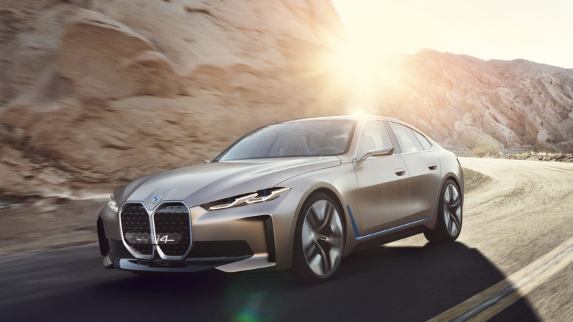

Now that the BMW i4 Concept is here, it’s time to compare it to its main competitor — the Tesla Model 3 Performance. Of course, no one outside of BMW has driven the actual i4 just yet, so we can’t comment on how they compare on the road. However, we can compare their styling, so that’s what we’re going to do. (Full disclosure, Tesla doesn’t provide a ton Model 3 Performance photos on its press site and not all of them line up well with i4 Concept photos. So I used a mix of regular Model 3 and Performance photos. But since they’re barely any different, it works out fine)
Of course, the BMW i4 Concept is just that — a concept. While the Model 3 is a full production car. So comparing their styling might be a fool’s errand. However, the i4 Concept is said to be incredibly close to production-ready, so the final production car will look very similar to the Concept we’re looking at now. With that said, we can start comparing the cars’ styling a bit.
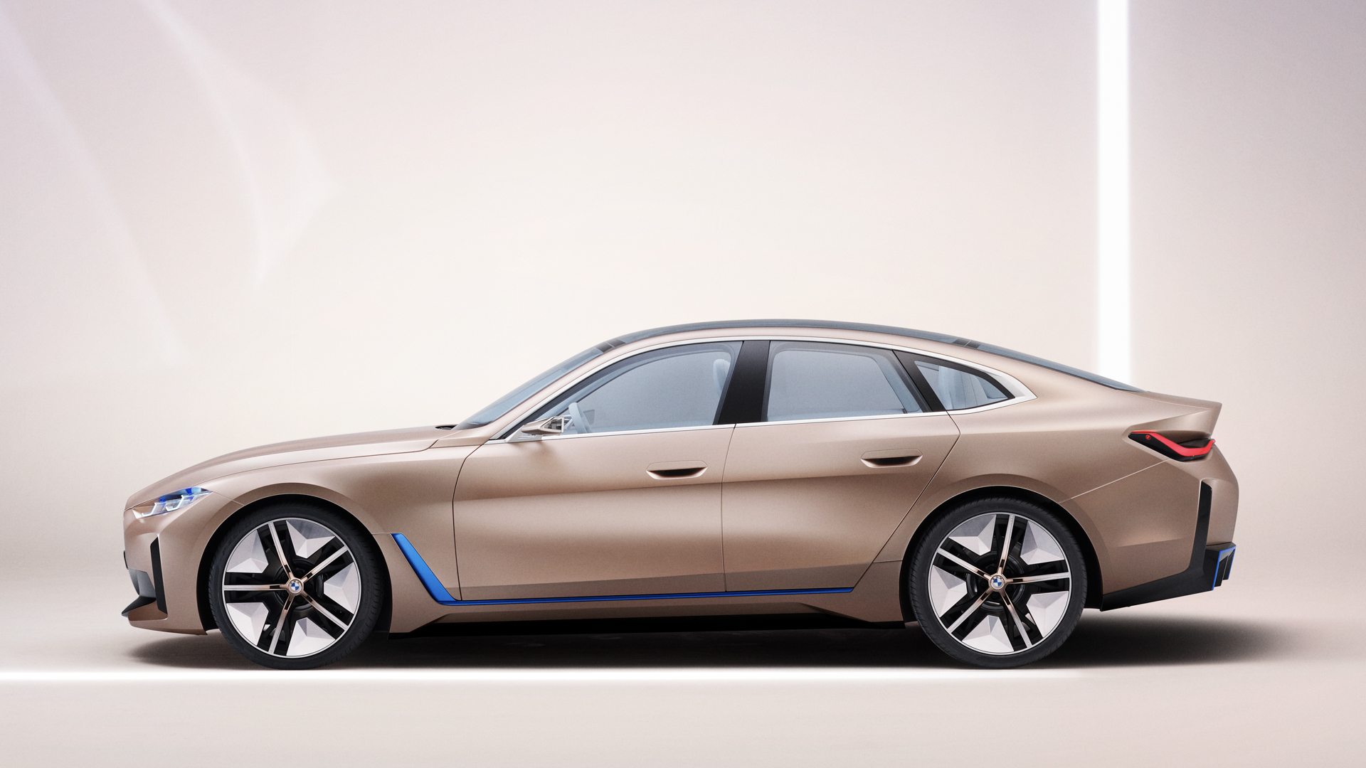

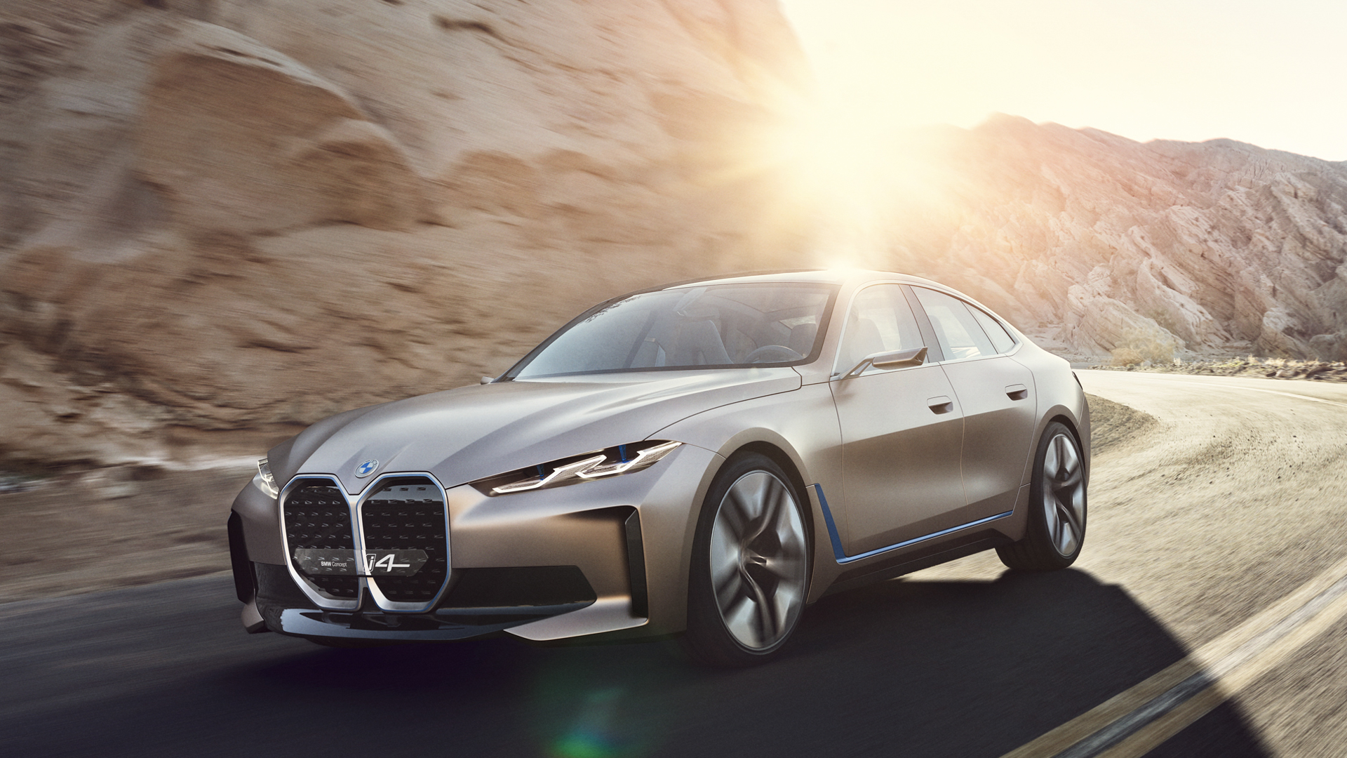
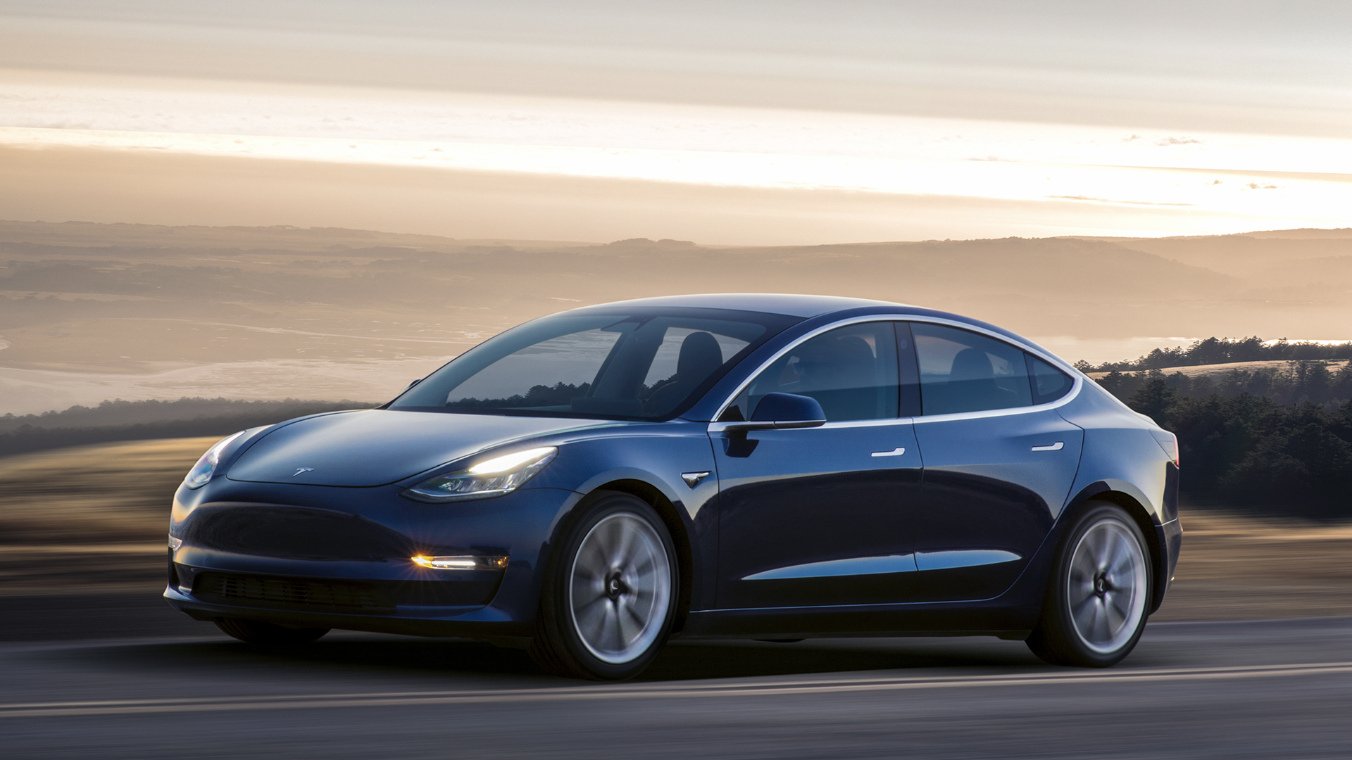
It’s clear which of these two cars is the more interesting, exciting looking car — the BMW i4 Concept. I’m not saying it’s necessarily better looking, as it’s certainly quite funky. However, it’s the more interesting looking car for sure. The Tesla Model 3 is just a vanilla blob, with no real interesting design cues to speak of. In fact, the most interesting part of its design is on top of the car, where you can’t see it; it’s glass roof. Aside from that, it’s about as bland as cars get. I’m also not saying the Model 3 is bad looking because it isn’t. It’s just boring.
In that regard, these two cars are the antithesis of each other. The Model 3 is just a bar of soap while the BMW i4 Concept is heavily sculpted, has muscular haunches and big, bold features. The i4 Concept has those two monster grilles while the Model 3 lacks a grille altogether, something I’ll never get used to; it looks like Keanu Reeves when he gets his mouth sewn shut in The Matrix.
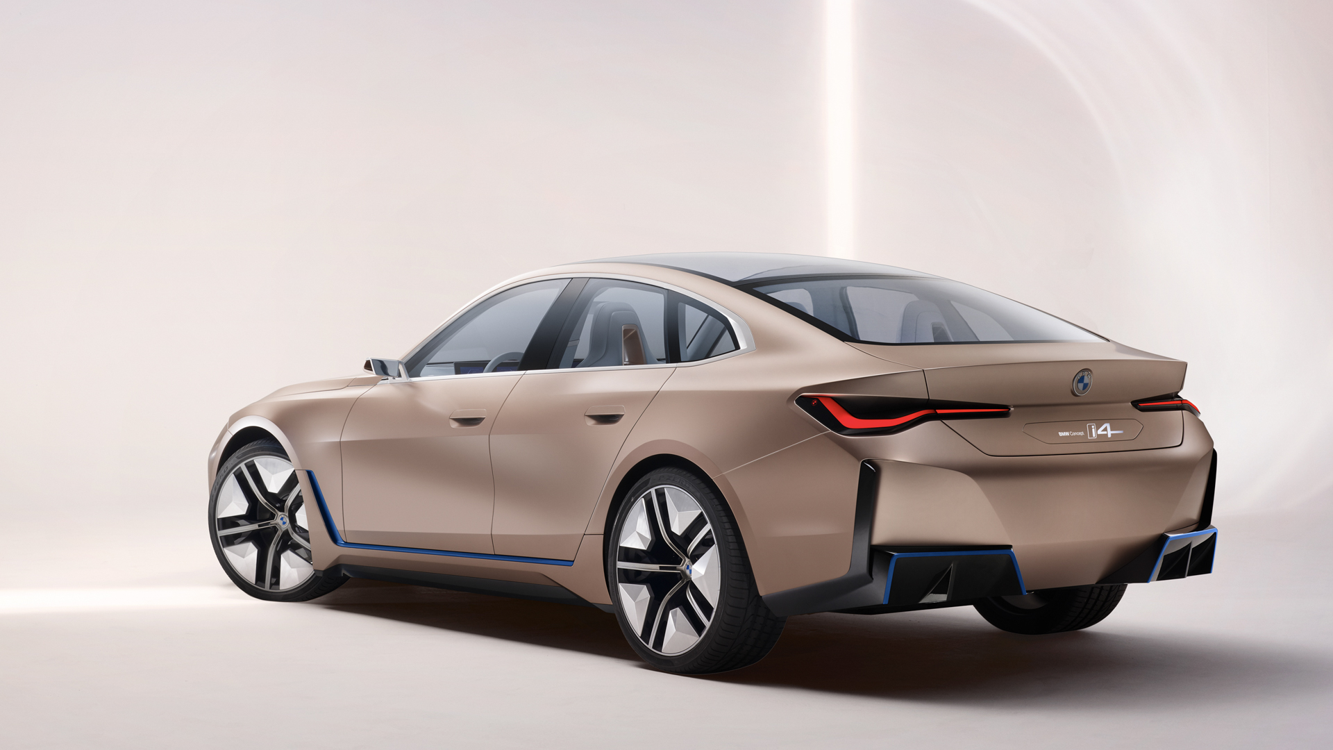
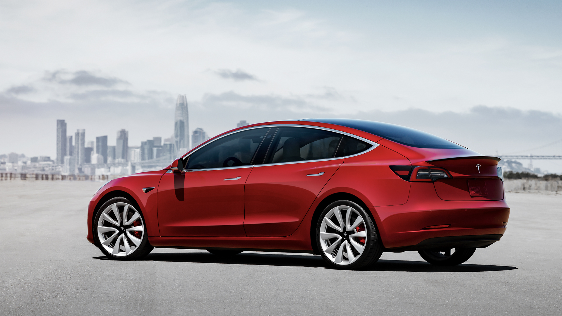
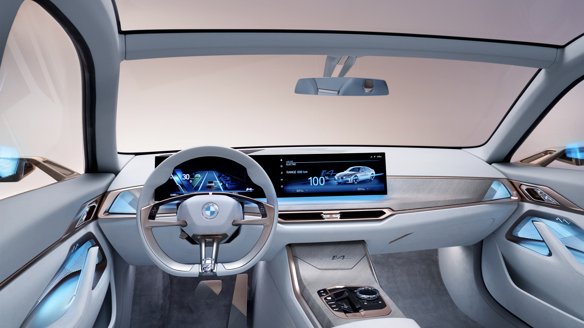
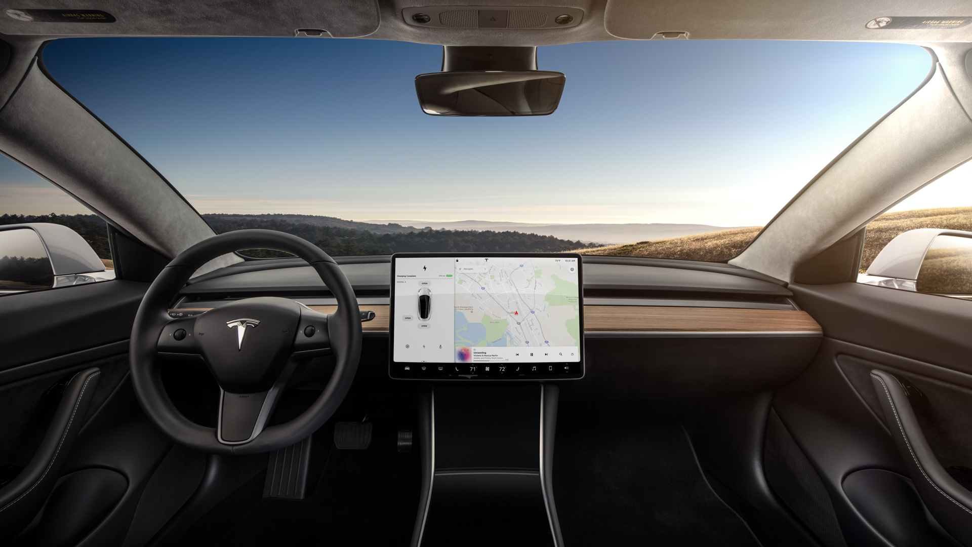
On the inside, that same sentiment remains. The Model 3 doesn’t have a bad looking interior because it doesn’t really have much of an interior to speak of. There’s a giant screen, a steering wheel and some seats. That’s about it. Communist-built Ladas had more flamboyant cabins than the Model 3. At the same time, the BMW i4 Concept looks like what Jay Gatsby thought the Roaring 2120s might be like. Personally, I don’t love the exterior of the i4 but I love its interior. While the former is overly absurd, the latter is the perfect blend of futuristic minimalist and opulence.
If I had to choose, based purely on style, I’d go for the BMW i4 Concept and I don’t think I’m alone. It’s an insane looking car, the i4, but I’d take insane over completely lifeless any day. Again, the Model 3 isn’t a bad looking car; there’s nothing objectively wrong with it; it’s just as about as exciting as stale white bread.
The article Photo Comparison: BMW i4 Concept vs Tesla Model 3 Performance appeared first on BMW BLOG