The True Story Behind the Meaning of the BMW ///M Colors


For years, there’s been some confusion as to the origins of the M Division’s colors. Which is surprising, considering that there may not be a more famous color combination in the entire automotive industry than BMW M’s three red, blue and bluer-colored stripes. There are rumors, of course, but the actual origins of the brand’s famous colors have been murky at best for decades. Until now, that is.
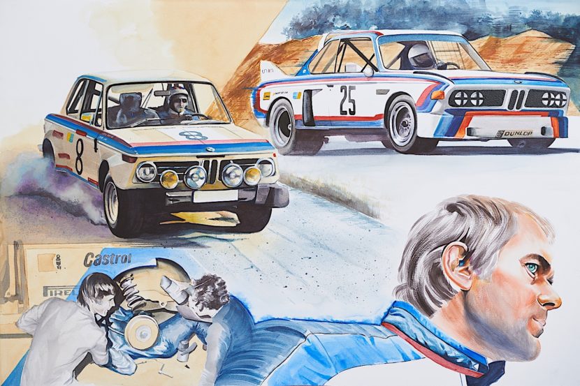
Back in the 1970s, BMW created the M Division, after its customer teams kept losing to Ford. In a nutshell, BMW stole Jochan Neerpasch away from Ford’s factory racing team and made him the head of its own new factory racing team — BMW M.
As Neerpasch was leaving Ford and going to BMW’s freshly-founded M Division, he also brought with him Ford’s star driver, Hans-Joachim Stuck.

During the process of creating its now-historic M Division, BMW needed sponsors, like any other racing team. So prior to actually putting a racing product on the track, BMW went shopping around and decided that it wanted Texaco — who was Ford’s sponsor at the time — as its main partner.
So, in an attempt to court Texaco, the Bavarians designed a logo and racing livery with three stripes, one of them being red, the color of Texaco’s logo.

A light blue stripe was added opposite the red stripe to represent BMW, as it’s a similar blue to the Bavarian flag colors featured in its own Roundel. Sandwiched in between the red and light blue was a purple color, designed to represent a combination of the two colors, a nice transition between the colors, if you will.
This three-stripe livery was then used to try and bring Texaco on as the M Division’s sponsor. The “red” was supposed to be the hook for Texaco. However, prior to BMW actually putting an M Division product on the field, the deal between BMW and Texaco fell through. We don’t know why, exactly, but we do know that the deal ended before it even began.
Despite that, BMW had already designed both the logo and livery and actually really liked it. So BMW M decided to roll with it and thus the iconic three-stripe “///M” logo was born.
Another interesting tidbit here is that Texaco was at the time present on Ford Factory Race Cars.

Over time, the ///M logo went through some changes, the most important changes being the purple turned into a dark blue color.
We previously reported on the origins of the M logo but we were, unknowingly, only about 90-percent right at the time. Since then, there’s been some more confusion. So we decided to reach out to a source of ours at BMW Romania, Alex Seremet, who’s hosted the man himself, Jochen Neerpasch, at several BMW events and actually spoke to him about this very subject.
So if you want to bore your friends at the bar about the origins of BMW M’s logo colors, you can tell them the real story: BMW wanted a partnership with Texaco, the deal fell through but BMW M still liked the logo and livery. And remember to tell them you heard it here.
The article The True Story Behind the Meaning of the BMW ///M Colors appeared first on BMW BLOG