Unpopular Opinion: I Like BMW i4 Concept’s New Logo


The all new BMW i4 Concept isn’t the only new aspect of BMW design that fans are up in arms about. Along with the i4 Concept, the Bavarians also rolled out a new logo and it seems that the majority of BMW enthusiasts are upset about it because of course they are. While I’m not one to sugarcoat everything BMW does, in fact I’m often lambasted for my criticism of the Bavarian brand on what seems like a daily basis, I have to admit, I think BMW made the right move here. Not only do I think the brand did right by updating the logo, I actually really like the new one.
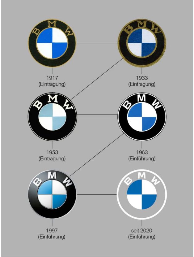
BMW’s new logo is drastically different than the one it replaces. It’s likely the most radical change the logo has ever gone through. BMW has changed its logo several times over the decades but, prior to this week, it’s been the same since 1997. That’s a long time to not even slightly update the logo and the 1997 one was starting to seem old-fashioned.

The logo introduced in 1997 had a sort of three-dimensional design, with gradient shading and depth. That probably looked fantastic back in the ’90s but it was starting to look like something from, well, the ’90s. Now, the new logo is completely two-dimensional and flat, which looks far more modern and simplistic. To be honest, I really like the look a lot and I think it’s about time that BMW made a change.
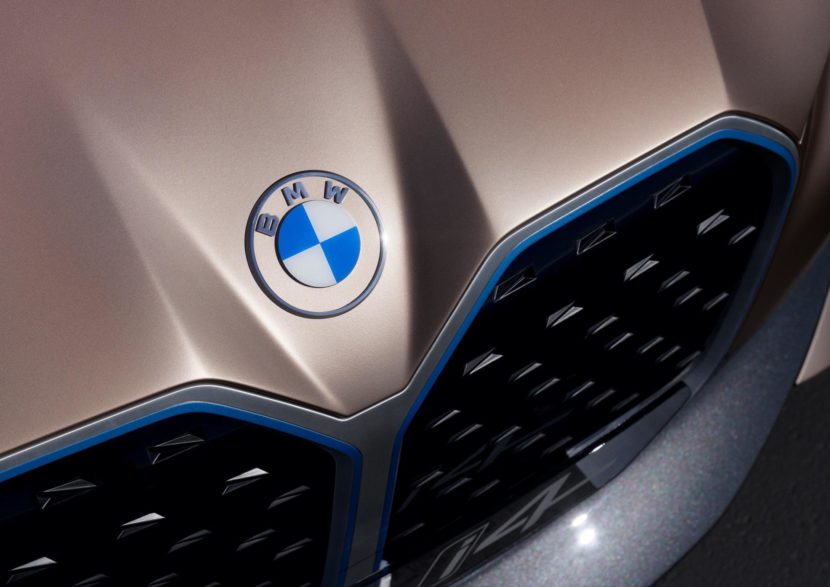
What’s more, I even really like the aspect of the logo that most people dislike the most; the transparent outer ring. On the new BMW i4 Concept, you can see that the formerly black ring surrounding the Bavarian Flag-colored center has disappeared. So outside the of the blue-and-white checkers is now just empty space, with a thin outer ring outside of that.
Most enthusiasts hate the transparency and, admittedly, BMW has said it’s not going to use this transparent version on cars but I actually think it should. The transparent version in on the hood of the i4 Concept and I actually think it looks really slick, especially with the metallic outer ring. Though, that version might not work on all cars except for BMW i models.

Either way, I like this new logo more than the outgoing one. Not only am I glad that BMW made the change but I actually like the change that was made.
The article Unpopular Opinion: I Like BMW i4 Concept’s New Logo appeared first on BMW BLOG